Cleaner UI/UX
I really love how Akiflow looks and feels, especially the rainbow gradient for daily goals. Love the customisation options available too, such as hidden sidebar elements / collapsable sidebar.
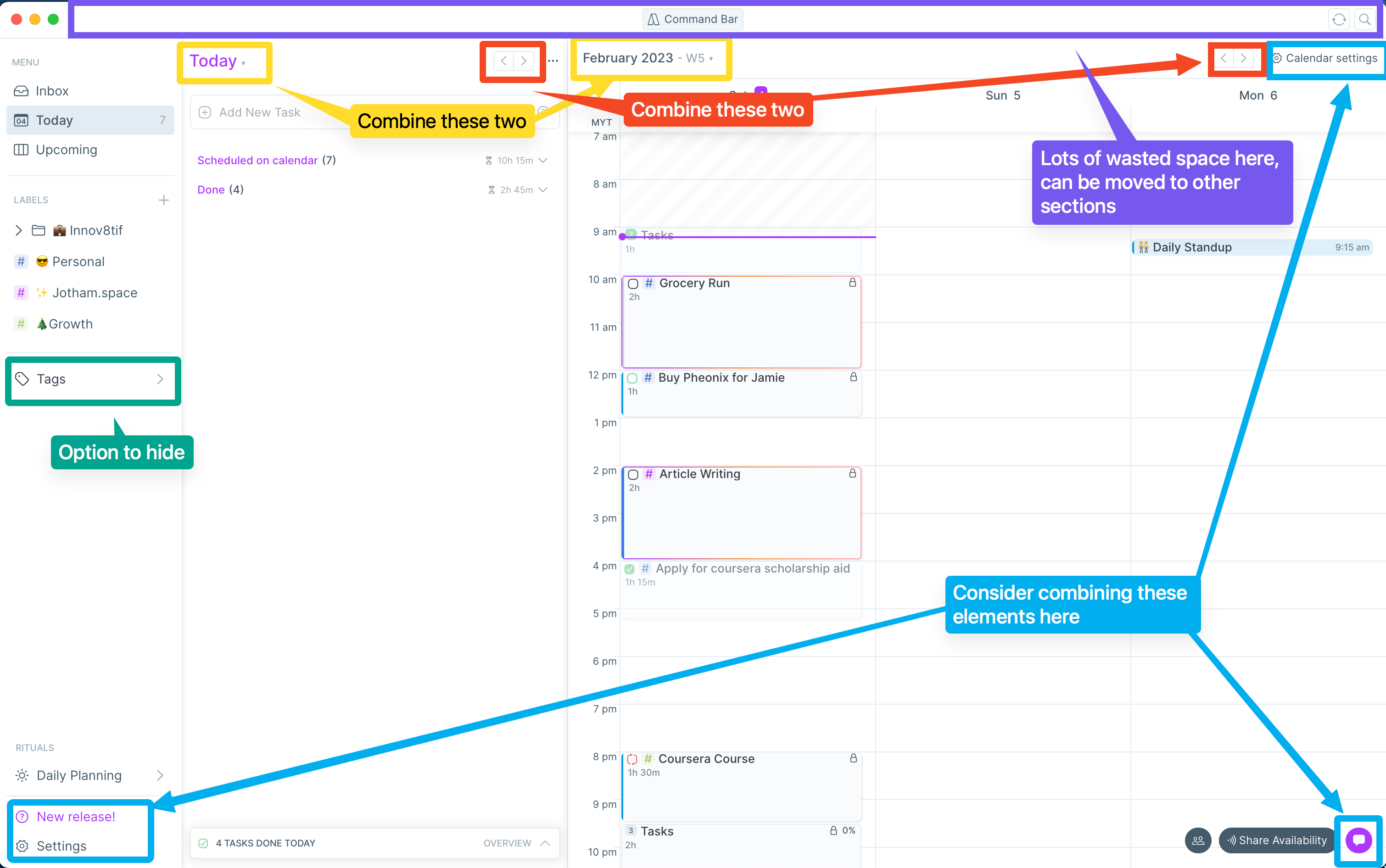
However, I feel that there's a lot of UI/UX sections that can be optimised, because there's still plenty of visual clutter. (Love how Sunsama dumps most settings behind the user's profile name,)
Here are some suggestions on how the UI/UX can be cleaner.
Log in to comment and vote
Comments4
Sep 19, 2023
Sep 18, 2023
Hi Jotham, after the latest releases, how do you feel about the new Akiflow UI? Thank you!
Jotham
Sep 19, 2023
Stefania: The new UI is a huge improvement in terms of visibility! Especially the ability to toggle a full-calendar view — this resolves the problem of having duplicated information (tasks & calendar) on the same screen.
I'm looking forward to the Subtasks update — would love to replicate the "Areas & Projects" feature from Things 3 — making Akiflow a good GTD system in addition to a to-do /calendar tool.
[Deleted User]
Feb 4, 2023
Hi Jotham, thank you so much for this 😍
We are redesigning Akiflow starting from the calendar, I'll ask for your feedback once the new design is live.
Some buttons that may seem duplicates have different functions. For example, you can change your calendar view while keeping the Today page fixed on a specific day, so we need arrows and dates both on the tasklist and the calendar.