Event colors more vivid
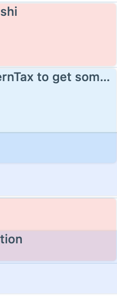
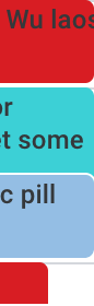
It's very hard to distinguish events on the calendar due to all the events being such light colors, so there is no contrast and all the events blend together.
Gcal does a 100x better job at this with how solid their colors are and it makes it way easier to quickly glance through my calendar for what I'm looking for.
Log in to comment and vote
Comments15
Sep 18, 2023
Hi everyone! With the latest release you can pick unlimited colors for your calendar events. You just need to right-click on an event and select your custom color :)
Discover more at this link: https://product.akiflow.com/changelog/calendar-is-on-fire-new-drag-drop-unlimited-colors-duplicate-events-and
Sep 18, 2023
[Deleted User]
Mar 15, 2023
Hi everyone, we just released a new version with brand new colors, I'd love to hear what you think about that:) Thank you, Stefania
Andrew
Mar 15, 2023
Stefania: I love them. Well done. So clean
[Deleted User]
Mar 15, 2023
Andrew: Thank you so much Andrew, I really appreciate it. Let me know if we can improve anything else:)
Andrew
Jul 22, 2022
I think the solution is merely letting us pick the exact color we want for labels and events per color wheel!
[Deleted User]
Jul 1, 2022
I agree here as well. I have a vision impairment and it's really difficult for me to differentiate what I'm looking at in the calendar.
The tasks and events are somewhat opaque, allowing the background lines to bleed through. This is odd. And in dark mode, many of colors aren't vivid enough.
A ton of changes probably aren't needed here—just something that makes it compliant with accessibility standards would be wonderful. 🙏
Katharine
May 16, 2022
Agreed!
[Deleted User]
Apr 7, 2022
agree 100%. Akiflows colours are too vivid to be of any use. G-cal doe sit best.
[Deleted User]
Apr 7, 2022
Hi everyone, in the last Akiflow release, the events' colors are more vivid. What do you think about it?:)
Andrew
Jul 22, 2022
Stefania: They're better, but itd be great if we could 100% customize the color. That will reach the broadest audience since everyone has different color scheme preferences.
[Deleted User]
Jul 22, 2022
Andrew: thanks Andrew!
[Deleted User]
Mar 30, 2022
I 100% agree. Gcal's events with solid colors are easier to visually distinguish, and the contrast with the empty/free spaces is more prominent.
Gcal even lets you set custom colors that, if too light, get the text in black (looking like Akiflow's current visuals). It would be great if these settings reflect in the AF app like they are on Gcal.
I think Akiflow would benefit from solid colors like Gcal'. The application would look sharper.
Also, as a designer, I would explore an option to let users choose if they want to get solid colors for only tasks, only events, or both.