Improve Task Layout and Readability
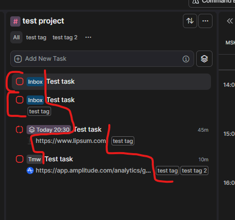
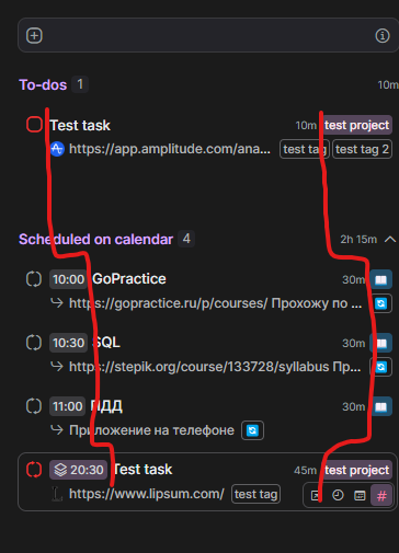
The third picture is a suggested layout of tasks, and the first and second ones show the issues I have with reading the tasks, specifically the inconsistency with the verticality of the tasks.
Please consider the following UI improvements for tasks to enhance clarity and readability, ensuring there are no disruptions during vertical reading. For example, links can be represented as simple icons (like the blue amplitude icon in the design), with a pop-up showing the link when hovered over, allowing the user to check it. When clicked, the user would be redirected to the link.
The comment icon would indicate that a task has a description, and a hover feature could be added for quick viewing. This means that for all tasks, we remove the beginning of the description as it is now, and instead, display the task source (e.g., a Notion icon), project, and tags. On the right, the task's date and time, as well as its duration, are always clearly and conveniently shown. This approach allows task names to be consistently readable without jumping around.
Additionally, in this design, the vertical space occupied by each task is standardized to always be two lines. This allows tasks to be visually processed more easily, as the eye perceives the equal spacing between the completion checkmarks. Please consider these or similar changes, as it is currently very difficult to read tasks when the task name is preceded by constantly varying text (date, inbox, etc.).

Log in to comment and vote
Comments4
Aug 28, 2024
Hi Sergei, in today's release we reviewed the tasklist layout, information readability and enrichment. Let us know what you think!:)
[Deleted User]
Aug 28, 2024
Stefania yeah, looks great! :)
Jeson P
Aug 28, 2024
Thank you for sharing this detailed insight about this. Our team are carefully checking feature requests to see and add relevant improvements and ideas. Our team will revisit this if we decide to work on this in the future!
[Deleted User]
Aug 28, 2024
Jeson P I see the new update has almost resolved the issue. The tasks are much more readable now! There's no 'inbox' prefix before the task name, and the time, duration, and project are moved to the right side of the task. Thanks!
There's only one small thing that still bothers me: tasks take up different vertical space depending on whether they have a description or not, but it's not that big of an issue. I would also suggest moving the project down near the tags to make it easier to read the date and time of the task. Additionally, it would be great if the date and time were placed one above the other to ensure consistent spacing, so the date doesn’t shift in the same line depending on the time.
Overall, it's already much more readable now. :)